Sign Design Tips: 8 Tips on Creating Effective Signage

The most effective signs are seen, understood, and followed. That’s the magic recipe – and it’s a lot easier to point out than it is to implement. Here are eight tips on sign design that’s unmissable, easy to understand, and makes an impact on every passerby.
1. Keep It Simple
The most effective sign is simple. Avoid clutter and make the most important message front and center. Make sure people will see it and understand it at first glance.
This tip isn’t limited to highway billboards. People who pass by your A-frame sidewalk sign will give it a quick glance. If they like what they see on the headline, maybe they’ll stop and read further. But if they don’t know whether you’re selling sandwiches or massages at first glance, they’ll keep going.


Take the signage we created for Milhaus, a nationwide real estate development company. They offer a long list of amenities at their property, but seeing a long list isn’t going to grab people’s attention. Instead, they highlighted one amenity that piques interest and gets people to their website.
How well did it work? They’re not a hugely successful, award-winning real estate development company for nothing.
2. Make It Actionable
If you don’t tell people what to do or where to go, you’re putting too much of the onus on the potential customer.
First, you want your headline to be actionable in and of itself. For example, instead of us saying, “We have the best crowd control equipment on the market,” we might say something like, “Get the best crowd control equipment on the market.” Rather than a simple statement of fact, we’re encouraging clients to learn more.
But beyond the headline (literally), you’ll want to display something for them to do. Something as simple as, “Visit us at https://soncocrowdcontrol.com/ today,” or, “Give us a call at (888) 766-2616,” will give a potential customer a method of contacting you.
Without it, people would need to think about how to get in touch with you. And too much thinking does not lead to very many customers.
3. Ensure It Matches Your Brand
This will be wholly dependent on your company’s identity. But the important thing is that all your ads are consistent.
If someone sees your billboard one day and then passes your storefront the next, that should reinforce your presence in the community at first glance. If your signage looks different from your store or website, people can get confused. And you can bet that confusion has ruined millions of sales this week alone.
Consistent brand visuals also burrow your products and services into the mins of the consumers. When they realize they have a need that you can fulfill, you’re more likely to occur to them if they’ve repeatedly seen consistent signage from your brand.
Then when they visit your website, they immediately know they’re in the right place by the reinforced design. Basically, everything about your brand should reinforce everything else.
4. Use High Contrast Colors
Purple on yellow. Orange on blue. Black on white. The easier it is to see your signage, the more effective it will be.
For example, let’s say you’re the only billboard for miles. No competition, right? Except that you’re competing against other cars, music, phone calls, vehicle passengers, it’s all competition for even the slightest of glances. And when they can afford to give you a second, you want to make sure they can take it all in instantly.
That example is when you’re in the least cluttered environment. Now imagine you’re alongside several other signs selling competing products.
That’s why high-contrast colors are so important. If the consumer finds anything hard to read, they’ll ignore it. If they find something hard to look at, they might go a step further and be annoyed by it. Neither is going to help you land a customer.
Even when everything else is done to perfection, colors that blend together are a death knell to the sign’s effectiveness.
5. Use the Least Controversial Font
The most tired joke in typography? That Comic Sans is a bad font. But the joke continues to circulate around the design community for one simple reason: people are still using it!
And while Comic Sans is the most controversial, other fonts can be disastrous as well. Even if you’re promoting a renaissance festival, a medieval font that’s hard to read won’t set the stage for what’s to come, it’ll mean fewer attendees.
If an unusual font makes sense, limit it to the confines of the logo. For the rest of the sign, use the most standard font that’s freely available, like Calibri, Cambria, Helvetica, or Arial.
6. Use Properly Rendered, Photo-Quality Images
There’s no way to sugarcoat it: a pixelated image says that the company is cheap and careless. That’s why the right file size is so crucial for printing. If you use a standard download image for a billboard, it’s going to look terrible when it’s blown up.
Rendering photos to huge proportions without pixelation requires programs and some knowhow, which makes using a service ideal for most people. (We’ll get more into the importance of dealing with an expert in the last tip.)
Put simply, there’s a reason sign printing services utilize specific templates and sizes. Beyond sizing everything right, you need properly rendered, photo-quality images to look like a professional, high-quality brand.
7. Pick the Right Place to Display It
To use the example from our client Milhaus again, the best place for their advertisements were at job sites where they were developing a new apartment building. There, they could promote the upcoming community or advertise existing properties.
Best of all, their job site was surrounded by temporary fencing, the perfect place for signage.
But an A-frame sign should be right outside the front door and two-sided to attract customers coming from both directions. If you’re just off the highway, you can use large and tall signage to attract impulse exits.
Most importantly, it needs to be somewhere people will see it. The more eyes on your sign, the more valuable the place.
8. Sign Design? Hire a Professional Team
Valuable advertising space can be squandered with a bad design. That’s why the safest bet is to go with an experienced team with a proven track record.
At Sonco, we have in-house designers ready to create the most effective signage both for your brand and the ad location.
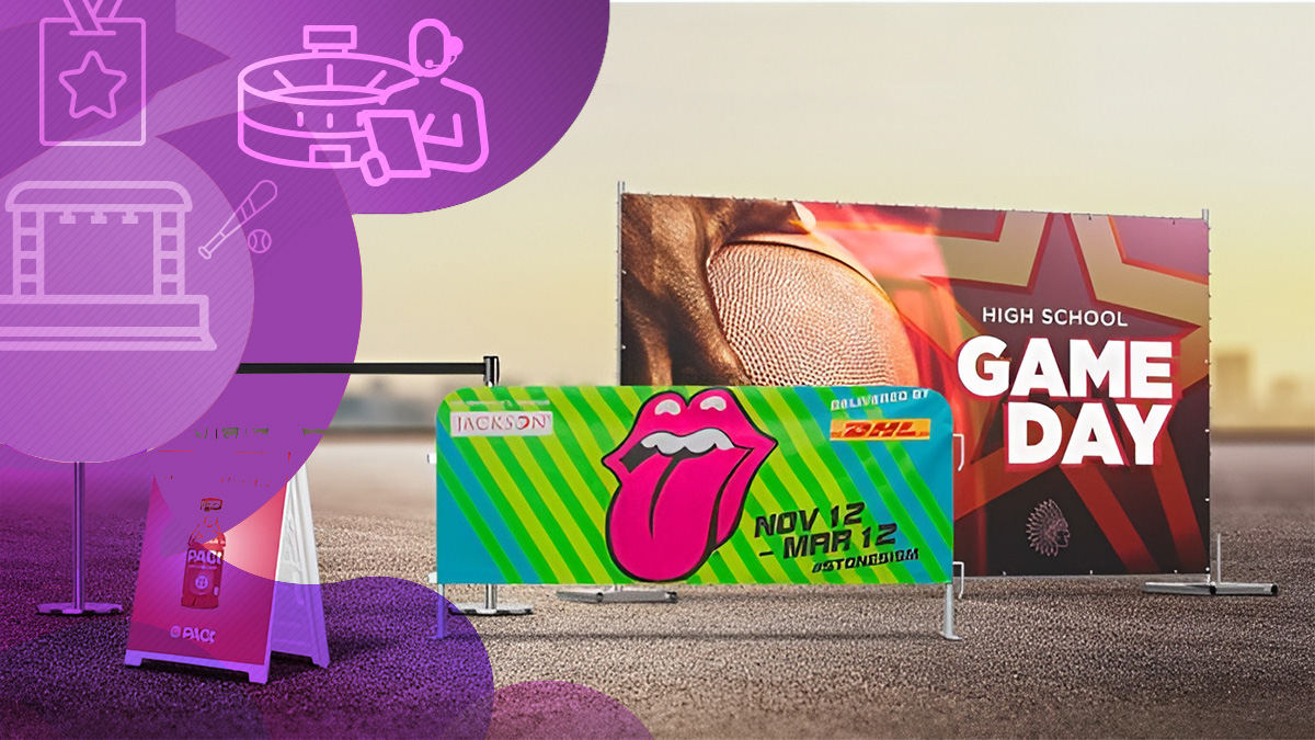
From barricade covers and fence screens to stage scrims and giant feather flags, we’ll make sure your offerings are unmissable, easy to understand, and make an impact on every passerby.
Trend now

Theme Park Safety: Avoiding Fines and Accidents with Crowd Control
Learn how crowd control products help keep theme parks safe, avoid accidents, and improve operations. Explore SONCO’s solutions for better crowd management.

Anti Scale Fence for Temporary High-Security Needs
Anti scale fence designed for temporary high-security perimeters, crowd control, protests, and emergency response where standard fencing falls short.

Why Bike Rack Barricades Are the Go-To Choice for Crowd Control
Explore why bike rack barricades are the go-to for crowd control. Learn how these versatile, durable barriers keep events, construction sites, and more organized.


